visible
Reducing support costs and improving activation with an account redesign.
00

problem
New Visible customers were unclear about what to do after purchase. Poor expectation-setting and in-app guidance led to increased customer care chat volume and ultimately, low customer usability ratings. Business goal: Reduce customer care contact rate by improving post-purchase activation and in-app guidance KPIs: Leading indicators (early signals influenced directly by UX changes) - Activation rate - Support contact rate (chat per user) Lagging indicators (downstream business outcomes) - NPS (usability + satisfaction) - CLV (driven by retention + reduced cost-to-serve)
solution
We treated this effort as a foundational product redesign rather than a cosmetic UX refresh. The objective was to make the app feel lightweight and intuitive for new customers while creating habitual value for existing users. Instead of optimizing isolated flows like activation or billing, we focused on the post-purchase experience as a system—anticipating user needs, reducing uncertainty through proactive guidance, and improving access to core service controls. The approach balanced near-term clarity for onboarding with longer-term engagement and lifetime value, while maintaining Visible’s playful, approachable brand. Guiding objectives: 1. Improve access to and control of cell service through the app. 2. Deliver clear, proactive guidance during early account setup. 3. Reduce post-purchase uncertainty across the account experience. 4. Build an app experience that users would want to engage with multiple times per day.
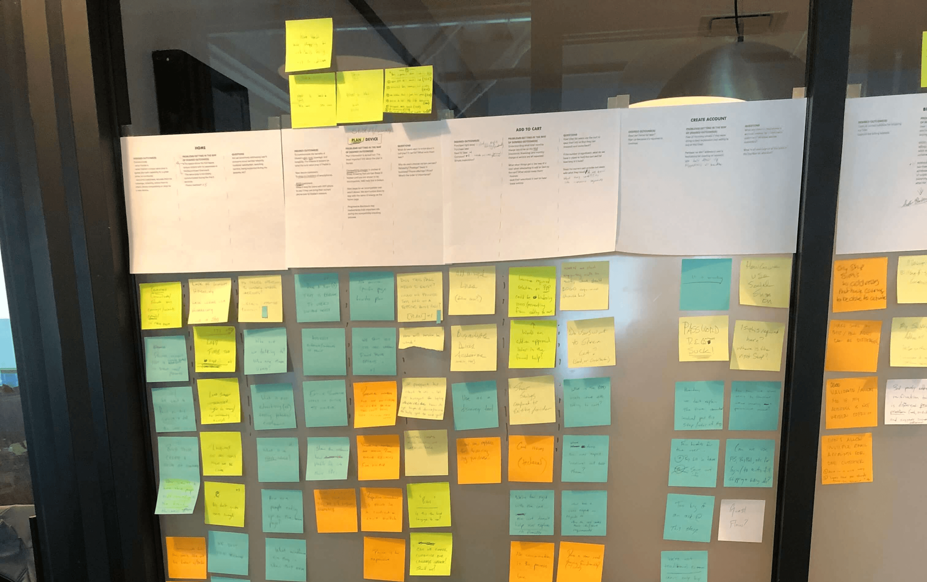
I chose to kickoff the with a 1:1 mapping exercise to capture key conversion flow milestones, friction points, and real data points that were dispersed throughout the company.

Research:
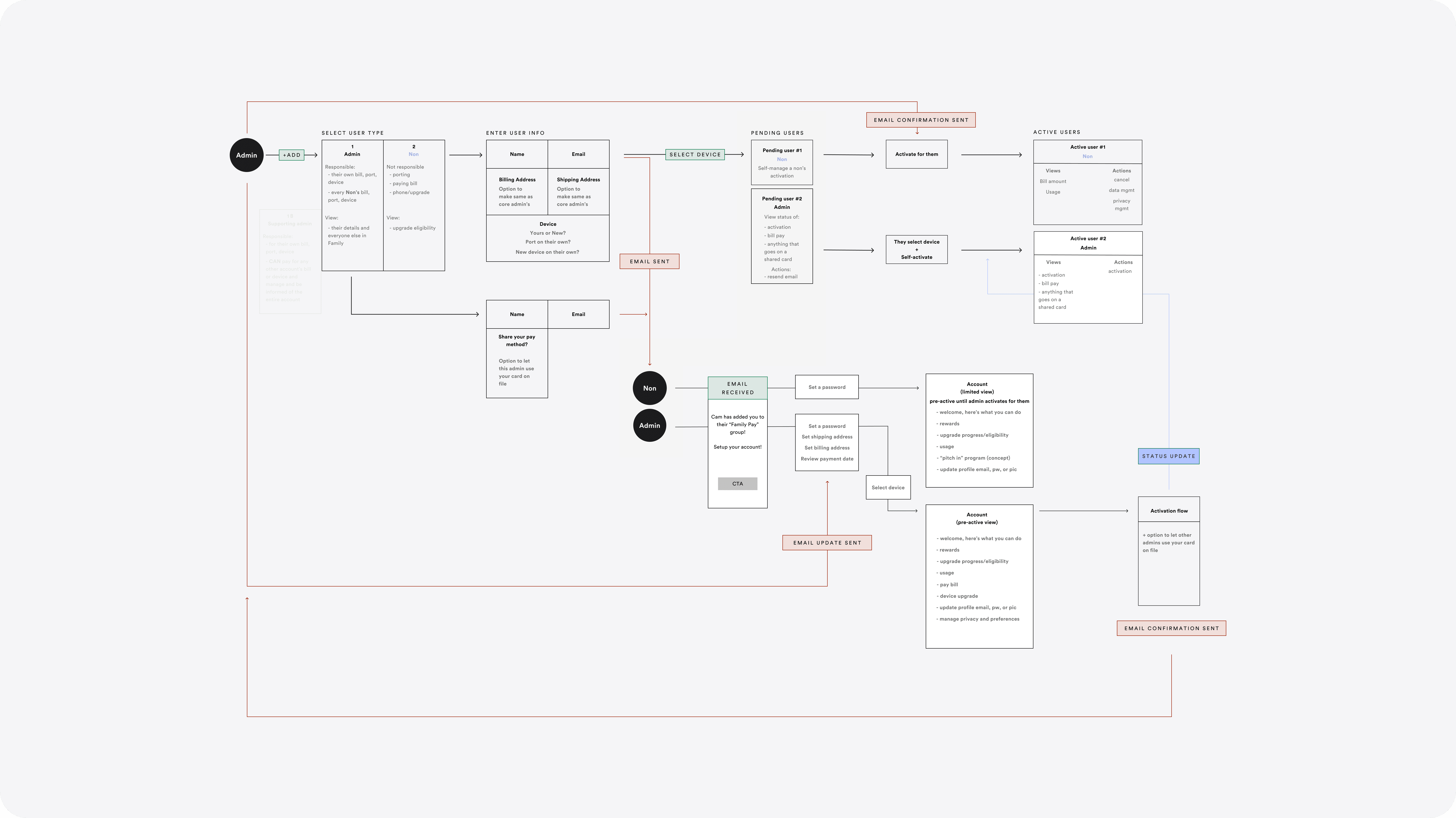
I started with a benchmark study to capture baseline user reactions to the current experience. This gave us a qualitative measure of where we were before redesigning anything. Then I moved into desk research because I knew the company had valuable information scattered across teams. I mapped the customer journey, then interviewed each product manager to understand what they knew about where the experience was breaking—insights, data, assumptions. I talked to customer care and our data team. All of this became the foundation for what we designed.
Hierarchy:
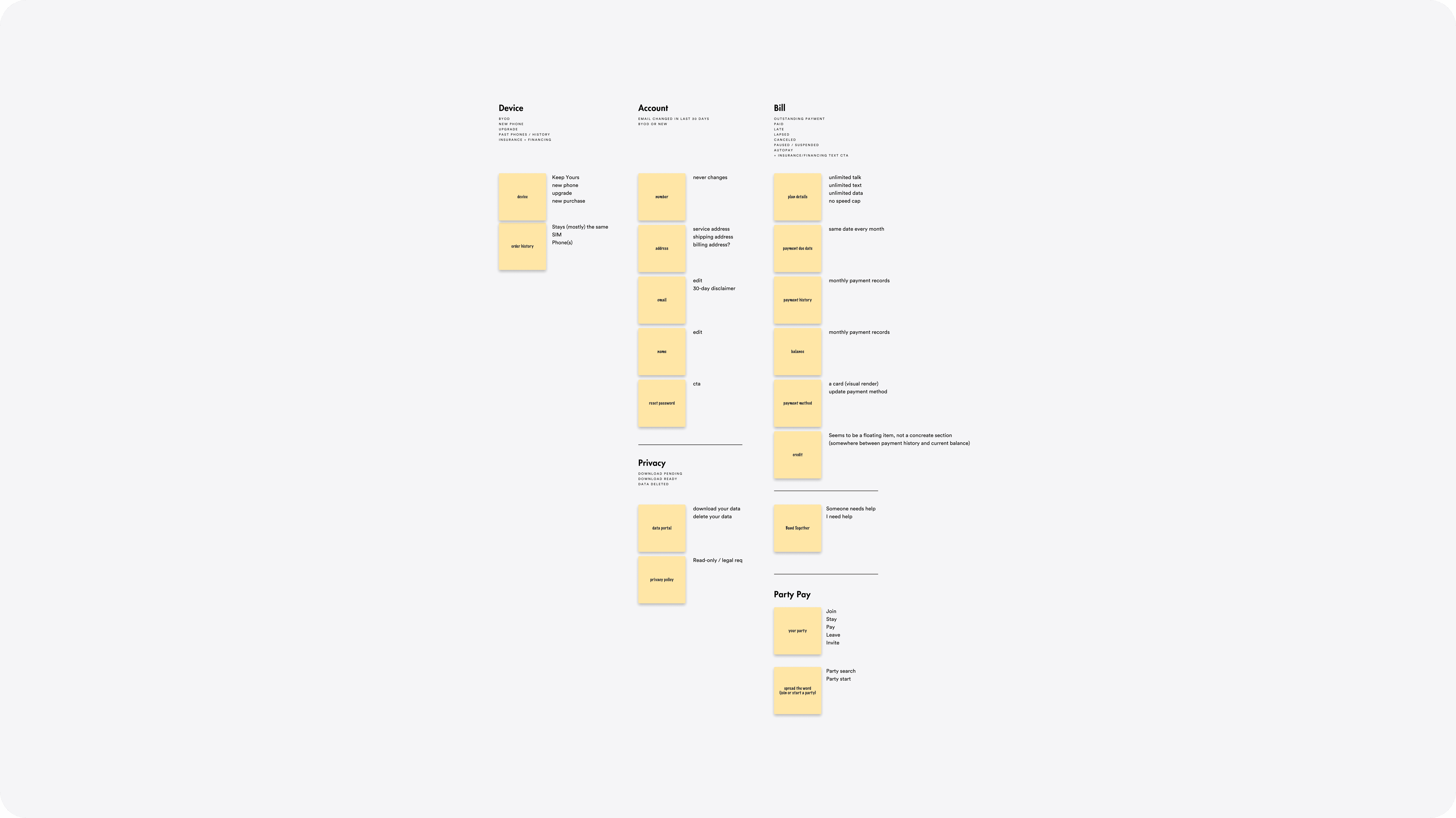
We restructured the app's navigation through card sorting with the design team. The existing structure had 6-10 flat categories—bill overview separated from bill history, related actions scattered across tabs. Users couldn't find what they needed and contacted care. I led us toward ruthless simplification, using care team data to identify where confusion started. We consolidated to 4 main categories organized around core user actions. Related tasks finally lived together instead of being scattered.
Visuals:
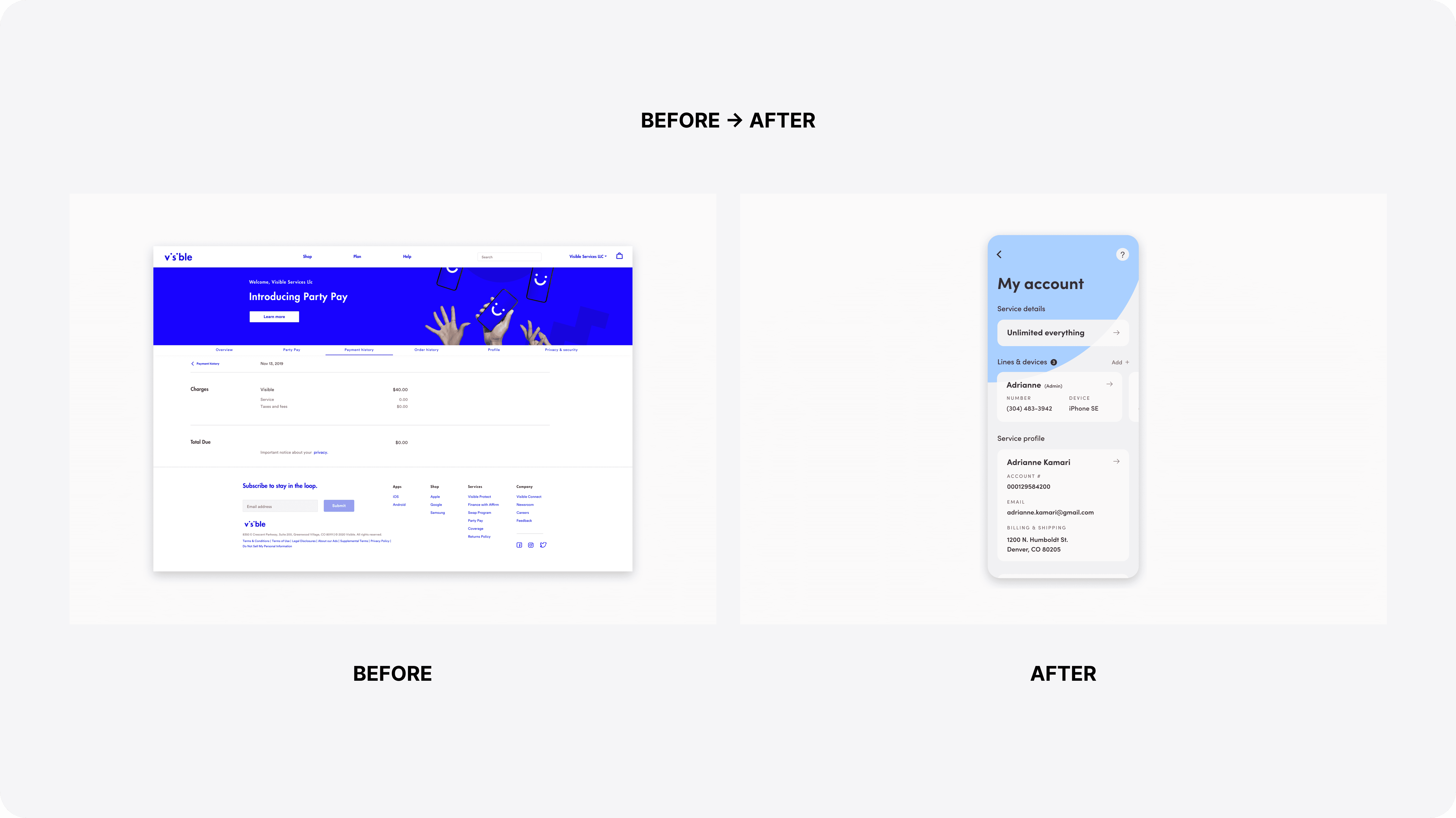
I started by establishing a lighter visual direction while designing post-purchase guidance from scratch. Early stakeholder interviews revealed they wanted an app that felt "more fun to explore and open multiple times per day"—not just a utility users checked once and closed. I explored how cards, imagery, and white space could make the experience feel lighter and more inviting. Then I pushed us toward a focal "explore" section designed to house engagement features we hadn't fully defined yet. The idea was to build the structure that would let us experiment with retention without redesigning the entire app each time. Once stakeholders approved the direction, I integrated components from the existing app with the new layout and discovery features. For the final pass, I paired with another designer to combine our concepts and bring the redesign to high-fidelity prototype.
Impact:
The redesign tested positively compared to our benchmark study. User reactions showed an 18% increase in ease-of-use ratings, 11% faster perceived task completion for bill pay and account management, and 43% more positive descriptions of the design. The new direction fixed fundamental UX issues, simplified navigation based on care team data, and gave the app the personality stakeholders wanted to drive daily engagement. Despite gaining buy-in across all departments, the project was shelved before launch.
Want the full, in-depth case study?
View it here →
timeframe
12 weeks
tools
Figma, usertesting.com, data suite
category
UI/UX
01

02

03

04

see also


