MENTAL HEALTH DASHBOARD
Peak is a place that patients come to every day to prioritize their mental health. The backbone of Peak’s MVP offering was a weekly prescription ketamine experience that helped patients to truly heal from their chronic, treatment-resistant depression and/or anxiety.
In the Summer of 2022, in addition to the core offering, patients would have the opportunity to receive coaching and custom therapy tracks based on their unique needs. As Peak made the pivot towards a more holistic offering, I was part of an ambitious project to redesign the Peak dashboard experience.
The Summary:
The Details:
Peak’s original web app was created with the goal of enabling clients to safely obtain and administer ketamine in healing, therapeutic doses under medical supervision in order to heal treatment-resistant depression and anxiety. Overall, the app was structured with a minimum series of actions to qualify for, and then continue treatment.
The business had outgrown its MVP app. With a new focus on bringing a more comprehensive solution to customers, it was time to rebuild the app from the ground up.
A New Chapter
App prior to redesign
The goal was to make Peak a place where patients could come to every day to prioritize their mental health while feeling inspired and hopeful about their futures.
Our high-level goals were to help a user:
Embark on their healing mental health journey
Contact and receive ongoing guidance from their coach
Understand their health and their progress
Long-term vision and daily action
THE CHALLENGE
My Role
I led the design of the patient dashboard experience between April 2022 and August 2022 and collaborated closely with Peak’s co-founders for the duration of the project.
The co-founders had product management and engineering backgrounds, so our brainstorming sessions were crucial.
I stopped working on the project once I’d handed over the design assets, aligned on component usage, and talked through intended functionality.
In September of 2022, new regulations were passed regarding tele-health and the founders at Peak made the hard decision to shut down as part of their commitment to put patient’s safety first.
At the outset of the project, we had a high-level vision and idea on functionality that the founders outlined. It was my job to extract more of their vision through thoughtful workshops centered around brand, the user journey, competitive analysis, and concept organization.
I also dove into a deep brand and UX-focused competitive analysis in addition to internal research into pain points in the user experience to bring clarity so that our decisions for the future felt deeply informed.
Defining a New Direction
KICKOFF
I spoke with each of Peak’s care team members to better understand the most common customer questions and hurdles. I connected with the on-staff Psychiatrist to understand the medical protocols that were required and what the patient’s long-term journey would look like. I also combed through anonymized call logs to find trends and quantify requests so we knew which problems to focus on solving first with our redesign.
Our goal was to understand the challenges that patients faced and how their experience was affected by these pain points.
EARLY INSIGHTS
Call Log Topics
The majority of scheduled care coordinator overview/intro calls were not answered by patients due to either an old number, the patient’s “unknown call block” smartphone feature being turned on, or the patient missing the call and then attempting to call back after the appointment window had expired, resulting in a reschedule.
No answer
Most patients had questions about the ketamine medication that was utilized during treatment. The main topics that came up were questions related to drug interactions, insurance and dealing with the pharmacy, and questions around what it was like to take the actual medication.
Medication, prescription, and pharmacy questions
The length of treatment, key milestones throughout, and how Peak worked on a high level were all top of mind for new patients.
General program questions
With several different appointment types and the ability to schedule any of them at any time, the cognitive lift of knowing which appointment type to schedule was burdensome and caused wasted time for care coordinators and patients alike.
Wrong appointment type
I empathize with the patients of Peak. Their journey with mental health hasn’t been an easy or straightforward process, and most of them had tried traditional methods to address chronic depression and anxiety with little to no lasting results. Most patients simply wanted more information about Peak’s program, Ketamine’s safety and efficacy, and how they should prepare for each virtual medical and non-medical appointment throughout their journey.
New Patients Needed More Guidance
THE DISCOVERY
“How could we proactively guide patients and help them to feel safe while avoiding overwhelm?”
I wondered how this might affect a user’s trust level and their own feeling of psychological and physical safety while working with Peak. How could we find not only a better way, but the best way to provide users with enough information to feel safe and begin to build trust, while at the same time avoiding overwhelm? These findings, our research, and this question were the beginnings of a north star.
Before I could jump into designing, it was important to define success and understand the most important milestones for care providers and patients.
Prior to the redesign, ketamine prescription and guidance through ketamine-assisted experiences was the focus. With that, user onboarding completion rate and program completion exit surveys were all that was used to measure the patient’s success.
I unpacked the concept of patient success and what it would mean to make them feel comfortable throughout the process, especially since the majority of patients suffered with chronic depression and anxiety.
I partnered with the team to unpack the current user journey so that we could identify the points in our unique program where patients had the most trouble.
DEEPER INSIGHTS
For first-time patients coming into our program, the care team would offer a consultation with a new patient, one call for general questions and a program rundown, and another call for medical intake review and qualification. We found that the care team ended up answering the same questions–ones that we could answer through the experience in order to help with scaling for the future and improve the experience and ease that our patient users experienced in the beginning of their journey.
General program information is a barrier to entry
The core areas we needed to educate patients around were the foundational aspects of Peak’s service, safety, and medical qualification.
Patients had a hard time grasping the high-level milestones of the 3 to 6-month process before and during treatment.
Program Details
Defining Successful Outcomes
“I’d love some clarification on the program. What’s the length of treatment? How do you determine dose? What should I expect?”
Patients were apprehensive about taking a medication that had specific setting requirements and that caused distortions in physical perception.
Medication Education
The original pricing structure was confusing for a customer base that simply wanted a result and had trouble grasping the different pricing tiers based on their treatment stage.
Pricing Structure
The care coordinators became the bottleneck for all of the above areas. The 3 most important subjects that patients were most curious about were hidden behind a human barrier—which would present problems in the future when the company was ready to scale.
Information Bottleneck
For people that have been living with chronic anxiety and depression, Peak is a place where they can come to every day to be inspired to prioritize their mental health and make progress on their journey towards healing. The backbone of Peak is the weekly ketamine experience that heals the brain and opens the mind. In between experiences, patients can heal and integrate their experiences via a series of therapy arcs. Coaches meet with patients biweekly, design their programs, and are in frequent contact.
Introducing Peak
THE DASHBOARD REDESIGN
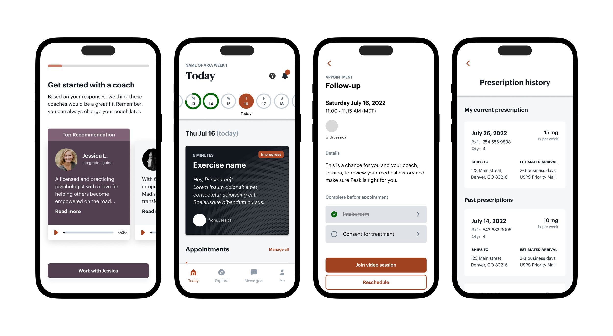
Select a coach to guide you
Select a single point of contact to work with in a 1-on-1 fashion throughout your mental health journey with Peak. Questions, post-experience integration, and personalized plans are all included so there’s no confusion as to who you have to reach out to in order to get the guidance and support that you need.
A more versatile dashboard
Know exactly where you are in your journey with Peak and know exactly what to do next. Geared towards encouraging progress along a patient’s personal mental health plan, the dashboard provides daily exercises, an alert task list for patient administrative tasks, and the ability to see daily exercise completion.
Informative appointment details
Since the majority of care team calls dealt with simple appointment preparation questions and paperwork, these were brought into a single “preview” view in the same location where a patient would go to launch their call at the scheduled time.
Prescription history and updates
Seeing past and current prescriptions in addition to shipping information and time estimates was an important part of several efforts to alleviate anxiety when patient’s were left waiting for their prescription to arrive in the mail.
Three primary questions informed my design strategy:
How can we provide enough guidance without overwhelming an already anxious patient?
How can we encourage users to complete critical tasks with minimal inconvenience?
Which successful mental models could we lean on to compile a framework for the new app?
Early on, it was important to understand the different factors that may influence the patient and coach experience. I spoke with our lead integration coach to understand her plans for the program. I also combed through each screen and step of apps with similar goals to ours; namely fitness apps and competitor experiences.
HOW WE GOT THERE
We found that the app’s mental model is most aligned with fitness and health apps that are centered around helping you make progress in an area that you know is beneficial, but that may be difficult to navigate on your own.
The experiences I combed through had a few models that overlapped and would serve us really well. I hand-selected those models to integrate into the app redesign.
The competitive analysis helped to further understand the existing mental models in the ketamine telehealth space.
Mental models
Viewing our competitors and the niche at large helped to hone in and translate the previously identified models into a design that helped put user’s minds at ease while helping them to feel hopeful about their journey towards better mental health with Peak.
I began with a few simple flows that captured how a patient would move through Peak’s ecosystem, and I also began to tag areas where emails and texts might trigger for our initial launch.
Flow and framework
Always know what’s next
“Historically, Peak poorly educated users who were mostly new to ketamine therapy”
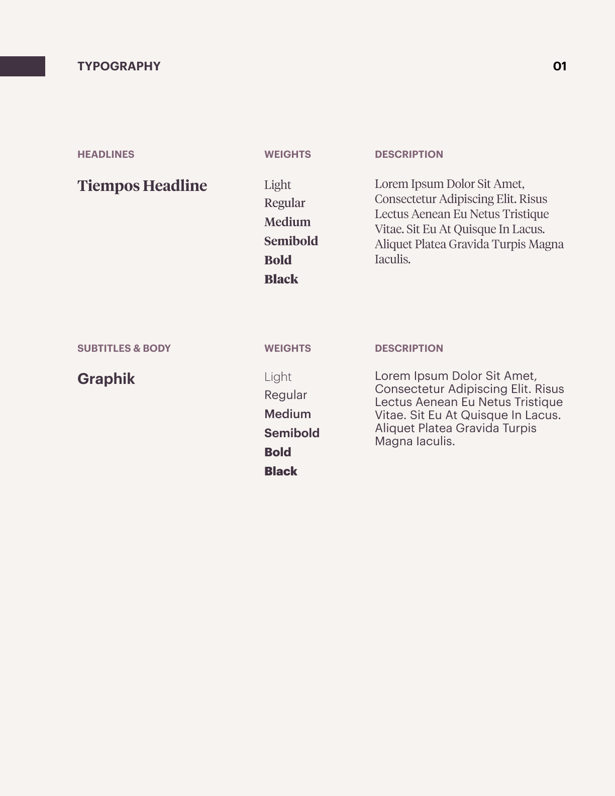
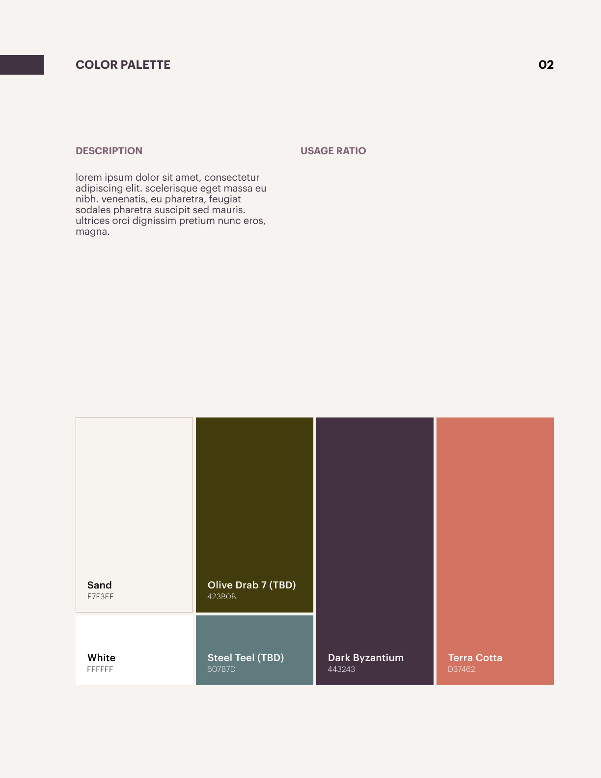
Coming into the redesign, the brand had a few colors, pieces of imagery and a few persistent tones throughout its copy and app experience. In order to think through how we could make more principled design decisions along with a consistent visual layer that would cultivate more trust through consistency, I led the team through some initial exercises to determine the new direction.
Since building something different inevitably results in multiple trial-and-error attempts, I took us through this exercise to save us time in the future and to seamlessly communicate our direction with marketing agency partners so they could easily extrapolate our vision.
A better defined brand
The future state of the brand. The ideal experience for our users. This meant clarifying the vision for the future of the brand in addition to doing some simple empathy mapping exercises to break down our unique users.
How might we form a program that’s both easier to understand and easier for the patient to own while feeling supported? Go from daunting and confusing to proactive and helpful.
How might we reduce the need for patient coordinators? Go from one to one to one to many.
How might we better adapt to varying levels of patient motivation to make progress on their journey? Go from tedious to encouraging and effortless.


How usability might be improved
Issues to address for longer-term development
Better user mental health journey analytics through increased anxiety and depression score survey completion rates
Enhance class signup and engagement
Improved coaching input throughout program experience
Lessons Learned
When a new concept or program is introduced to users, most of their anxiety is around, “…what happens next and what can I do to prepare?”
Sometimes, a temporary, non-scalable solution can help to find answers in a hard-to-test-with population. The coaching feature implementation was a great way to gather key information from users in order to improve the final touches of the overall product foundations.
I knew this before, but this lesson was reiterated: brand trust is everything. When I first started the project, I assessed the call logs and help tickets. The existing visual experience of the marketing website created distrust in users. Part of this, however, was due to the novel concept of in-home ketamine therapy for treating anxiety, depression, and PTSD
