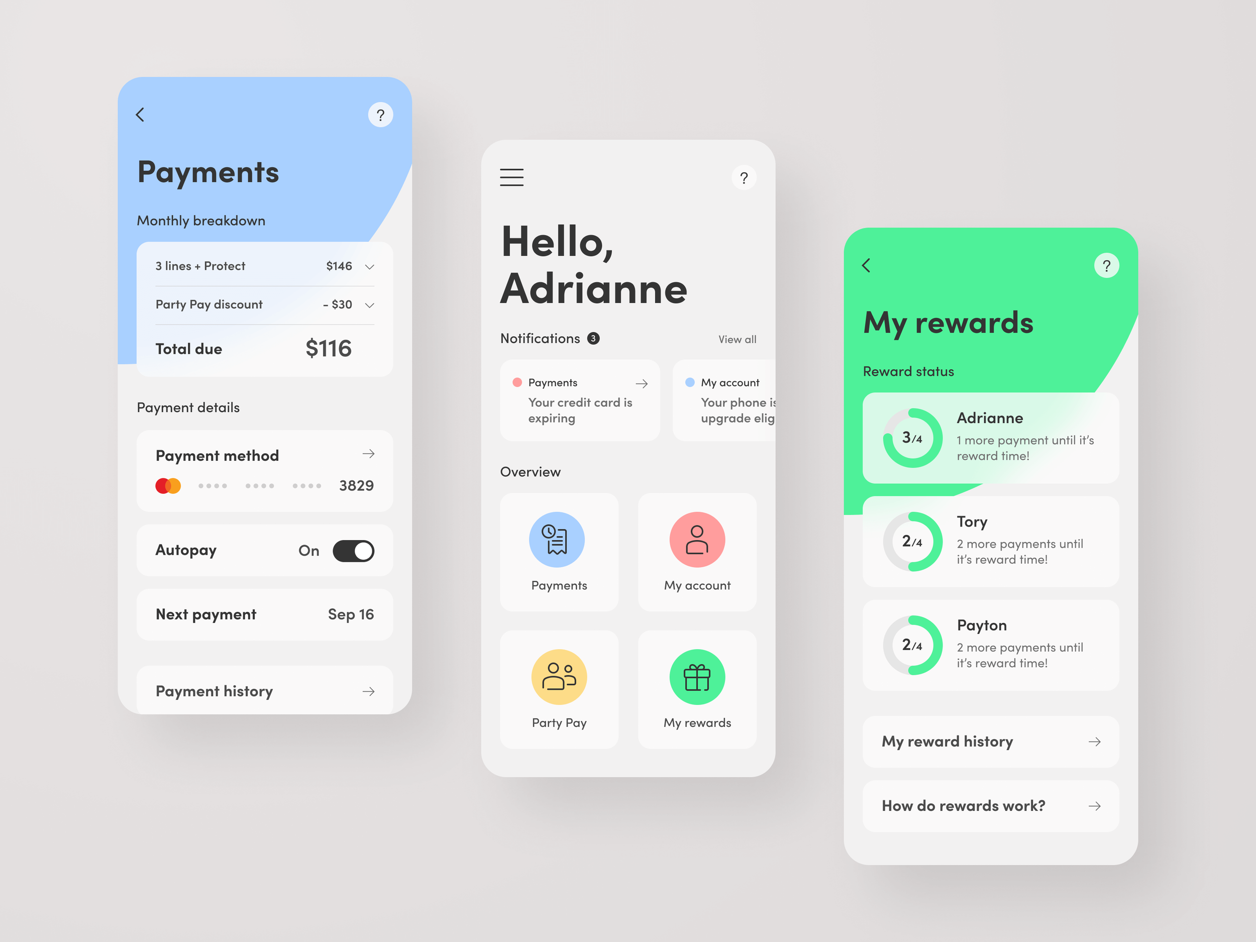
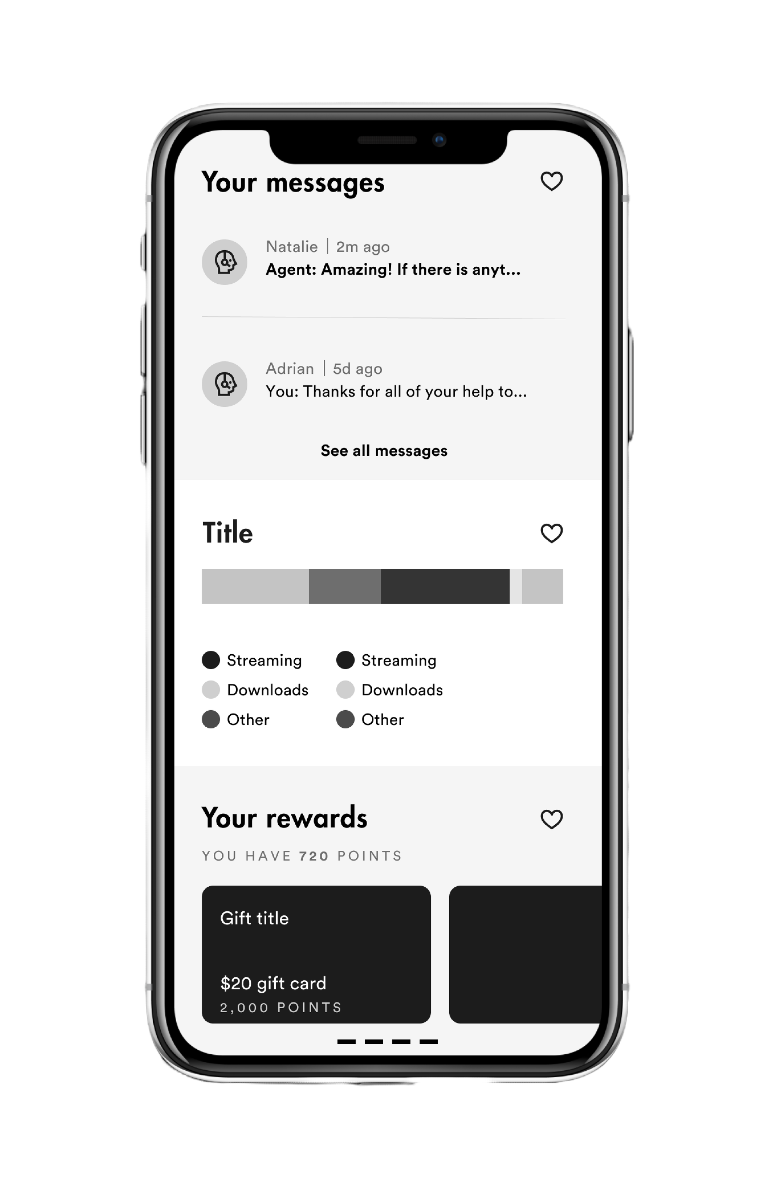
Visible reimagined cell service to be radically simple, accessible and inclusive.Eventually, the carrier’s vision was overshadowed by an app and account experience that was inconsistent and complex to use, especially for first-time users.
I was part of an ambitious project to redesign the Visible account experience for the startup that was named as the Best Telecom Brand by Adweek.
To comply with my non-disclosure agreement, I have omitted and obfuscated confidential information in this case study. All information in this case study is my own and does not necessarily reflect the views of Visible or Verizon Wireless.
DESIGN BY ACCRUAL
In just two years since 2018, Visible transformed from an invite-only cell service available only on unlocked phones to a top contender in the pre-paid wireless market. By 2020, Visible was named to Fast Company’s Most Innovative Companies list and was named Best Telecom Brand by Adweek in 2021.
The Visible app — designed in 2018, struggled to scale alongside the hyper-growth of the company. Fundamental usability was challenged. Disparate features and experiments competed for focus. App reliability and performance issues increased exponentially.
The Visible app had become disjointed and inconsistent.
Before 🡒 After
-

BEFORE
-

AFTER
THE PROBLEM
SELF MANAGING CELL SERVICE WAS TEDIOUS FOR USERS
Visible customers were experiencing difficulty navigating and receiving guidance from the Visible app, resulting in high account-related help tickets, and a poor post-purchase experience.
The interface lacked intuitive navigation and relevant information, hindering users from porting their numbers, activating, and performing admin-related account tasks.
The goal was to improve the user experience by designing an intuitive and efficient account interface, enabling users to easily receive the guidance they needed and complete their most common tasks with ease, leading to increased CLV, decreased support costs, and customer satisfaction.
USERS & AUDIENCE
THE VALUE SEEKER
Customer Insights & Ideation
I partnered with the heads of product and design and one other lead designer to uncover insights and translate concepts into features that address customer behaviors and motivations.
Oversight & Coordination
I designed across and collaborated with five platform designers and their PM partners to translate product insights into features and IA for the new app.
Experience Strategy & Vision
I created frameworks and prototypes to share the IA and web vision. This helped to evangelize ideas, gain alignment and drive decision making. I led information architecture workshops with product partners.
Design Execution & Validation
I designed down on a new web “light” experience and iOS. I executed journeys, wireframes and prototypes.
Planning & Scope Definition
I defined the product with my product and design partners. I evangelized customer goals and balanced business goals. I created concepts and negotiated features for launch.
Leadership
I designed up and presented works to gain buy‐in from department heads, senior stakeholders and many other Visible teams throughout the project lifecycle.
MY ROLE
UX RESEARCH, STRATEGY, DESIGN
THE CHALLENGE
REIMAGINE THE ACCOUNT EXPERIENCE IN 3 MONTHS
Our goal for the project was to reimagine an app experience that felt light and effortless for new users while encouraging existing customers to want to open the app multiple times per day. The original experience had simple intentions: set up new service and pay your bill. However, we weren't trying to do a simple UX cleanup. Our ambitions were to create a strong foundation that better anticipated user needs and that included features to boost customer lifetime value while upholding a playful and fun brand image.
Our high level goals were to:
Increase cell service access and convenience via the app.
Provide superior guidance to new users.
Reduce the uncertainty in the post-purchase account experience.
RESEARCH METHODS USED
-
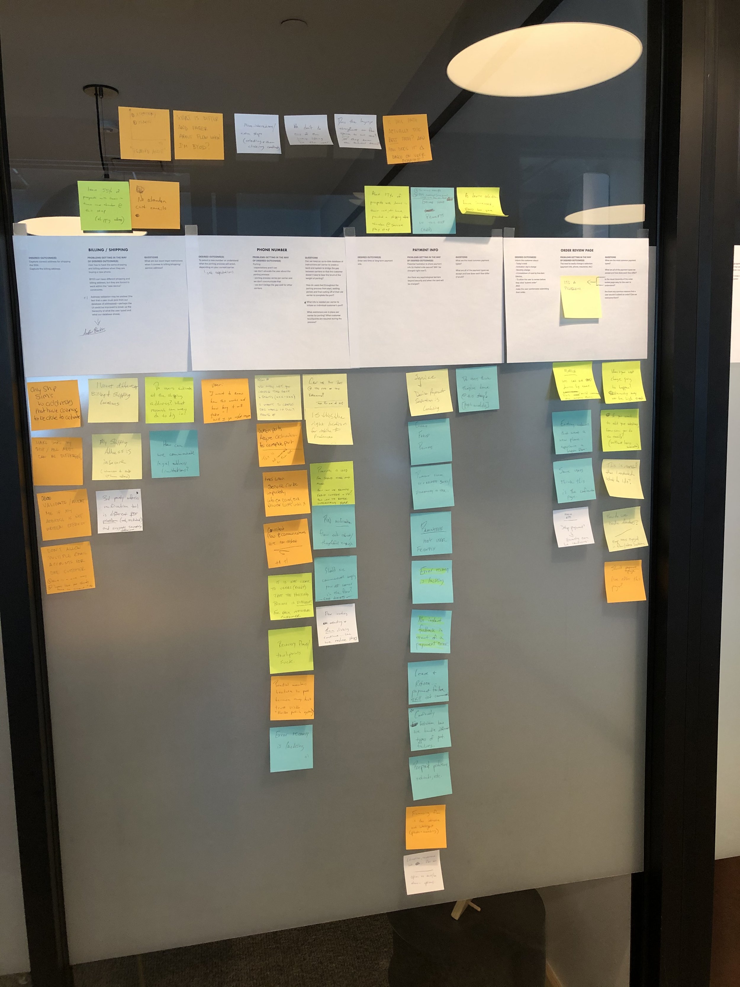
Secondary research that involves the summary, collation and/or synthesis of existing research.
Secondary research is contrasted with primary research in that primary research involves the generation of data, whereas secondary research uses primary research sources as a source of data for analysis.
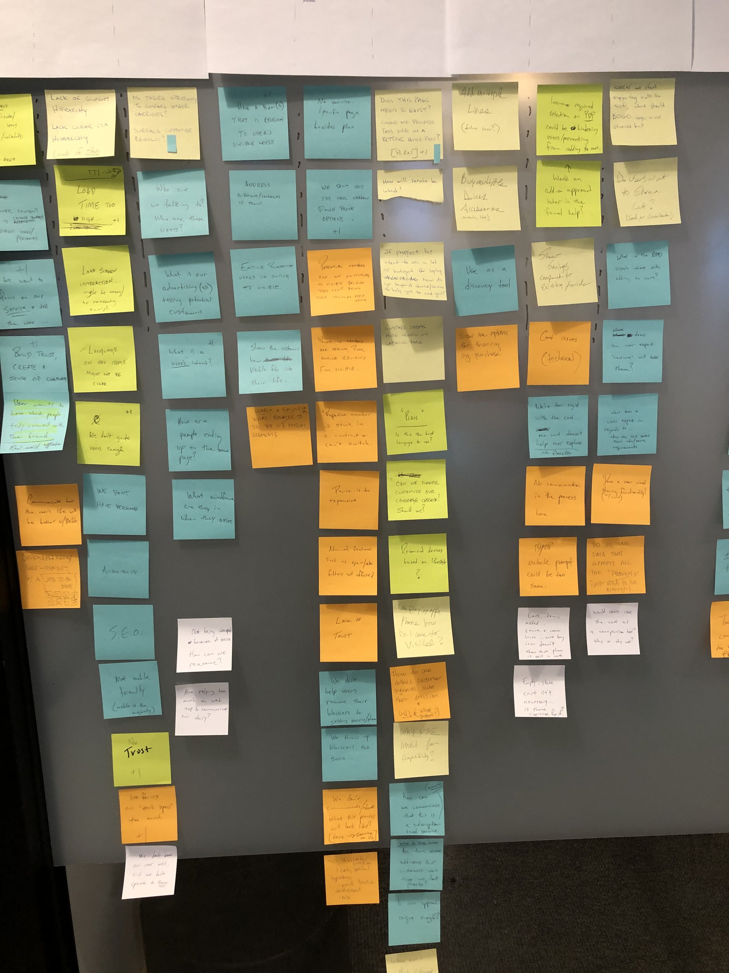
Why I did it: after talking with product, design, customer success, and data partners, I found that we were already sitting on a mountai of information that was stored in various repositories, individuals, and departments.
-
Participants are brought into a lab (or usertesting.com), and given a set of scenarios that lead to tasks and usage of specific interest within a product or service. Unmoderated tests were used.
Why I did it: to learn why users were struggling and how to fix it.
-
A type of analytics that involves analyzing the sequence of pages that users visit as they use a site or software application.
Why I did it: to understand what areas of the app users interacted with most, and to find which pages users initiated the help chat from.
-
A quantitative measure of attitudes through a series of questions, typically more closed-ended than open-ended.
Why I did it: to capture, in our customers words, what they wanted to prioritize when managing their cell phone service through the app.
-
A quantitative or qualitative method that asks users to organize items into groups and assign categories to each group. This method helps create or refine the information architecture of a site by exposing users’ mental models.
Why I did it: to guide the information architecture in a better direction that aligned with how people already thought about certain categories and hierarchy.
-
Open-ended and/or close-ended information provided by a self-selected sample of users, often through a feedback link, button, form, or email.
Why I did it: to see what users were saying to gather attitudinal data.
-
A technique used in market research and operations to outline all of the potential touch points a customer has on their path to purchase a product or service.
Why I did it: to align our team and to find the areas of the experience that were causing the most pain. The goal was to see how the app could help to improve the post-purchase decline in positive user emotion.
-
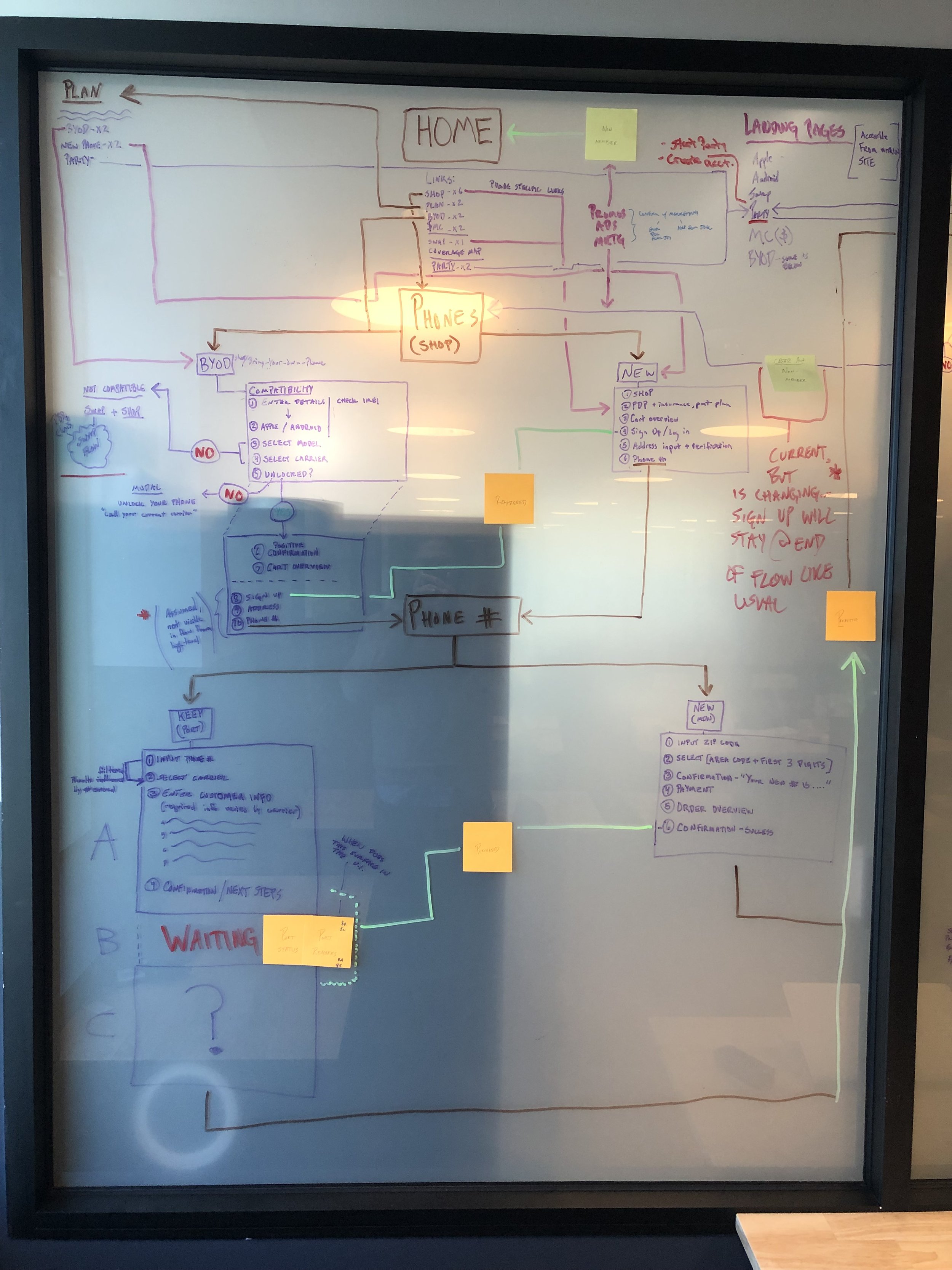
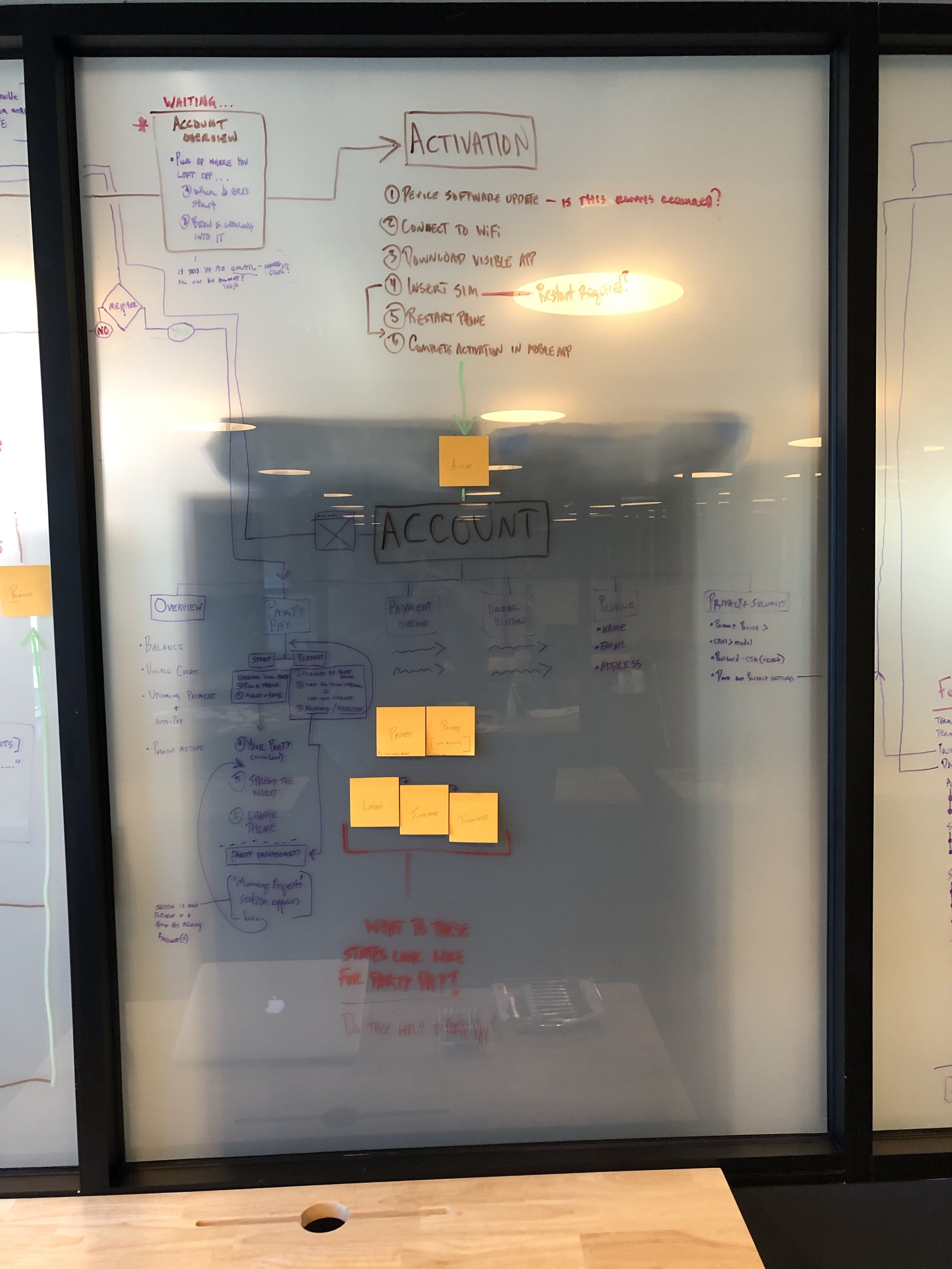
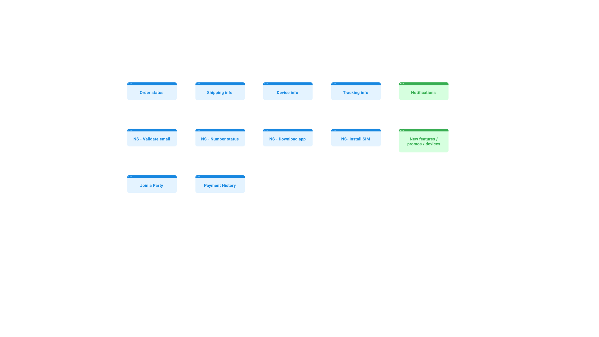
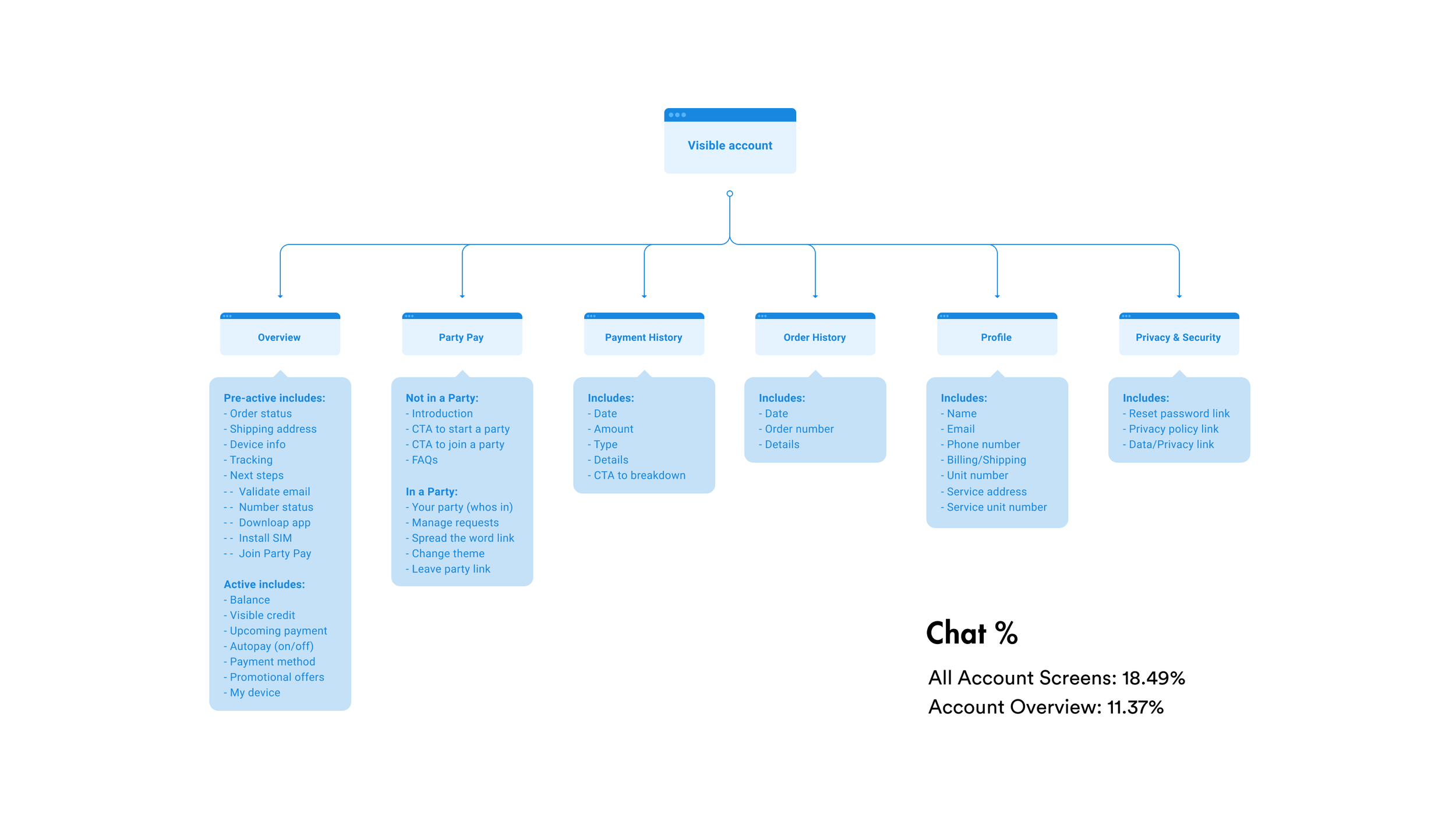
A way to capture information architecture and to define the relationships between different parts of an experience.
Why I did it: the internal team often struggled to create a shared definition of what existed. This exercise was another step towards creating shared alignment and focus while creating an easy way to discover pain points or sub-optimal information architecture.
-
Stakeholder interviews provide a broad overview of the interviewees' opinions about a specific topic that may reveal hidden concerns or ideas that would not be expressed in response to a set number of specific questions.
Why I did it: the Head of Product had a vision for the future of the app that included creating something that, “users would want to open multiple times per day.” We were moving towards an app that would aid in boosting customer lifetime value.
KICKOFF
VALUABLE DISPERSED KNOWLEDGE
At the outset of the project we didn’t have a clear visual direction for the reimagined app or specific goals for the account experience. Without pre-existing insights, I partnered with our PMs, data scientist, customer success team, and dug up past user test results to explore how customers were using the app’s account experience.
Since our team was struggling to understand where we were and where we were going, I performed 1:1 sessions with every product and design leader in the organization to gather insights, assumptions, and to align everyone around what we needed to focus on fixing first.
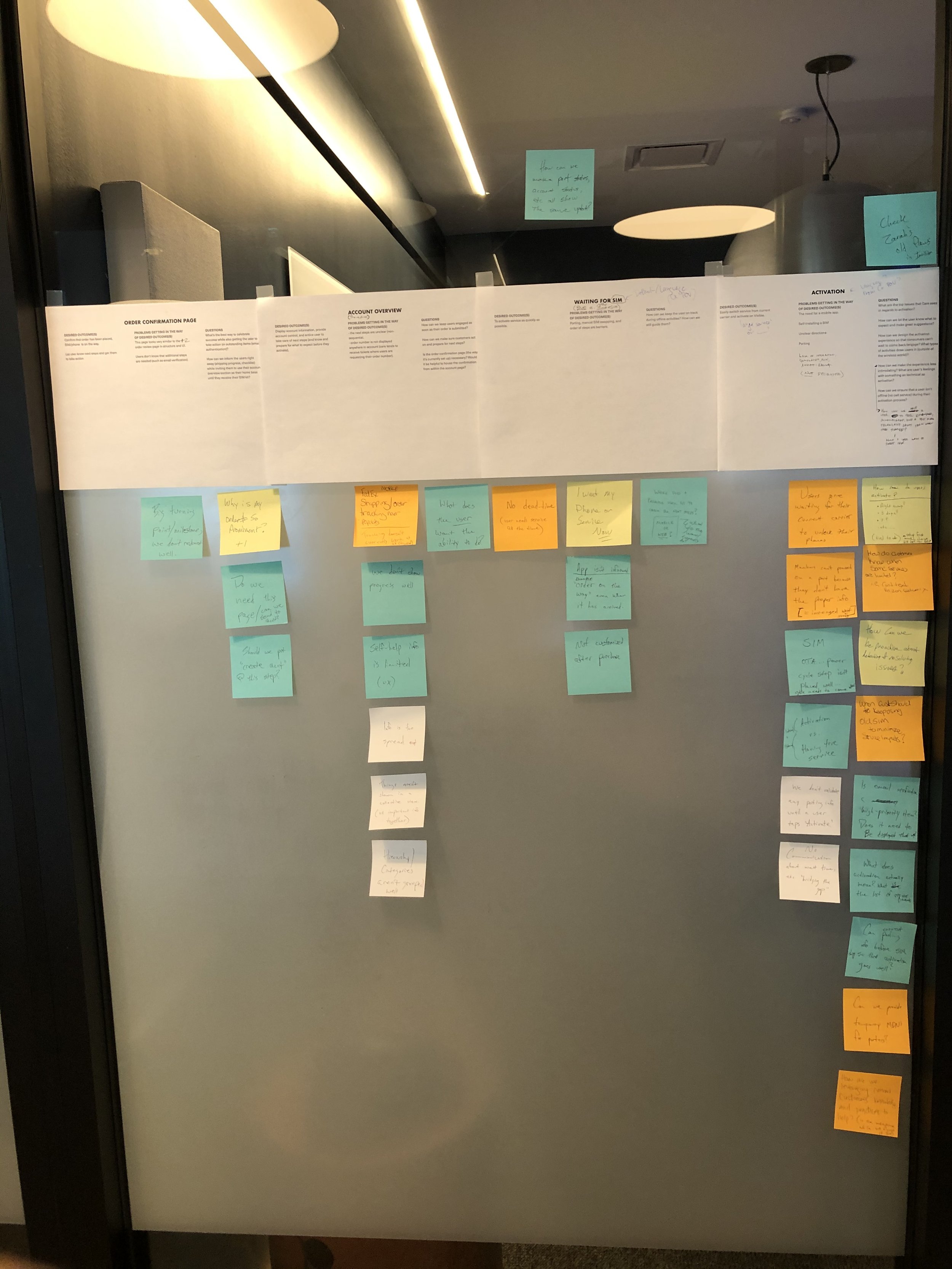
JOURNEY MAPPING
BUILDING ALIGNMENT VISUALLY
After a first-time user purchased, they immediately felt lost. When existing customers needed to manage their account, they struggled to quickly find what they needed.
EARLY INSIGHTS
BETTER GUIDANCE AND STRUCTURE NEEDED
-
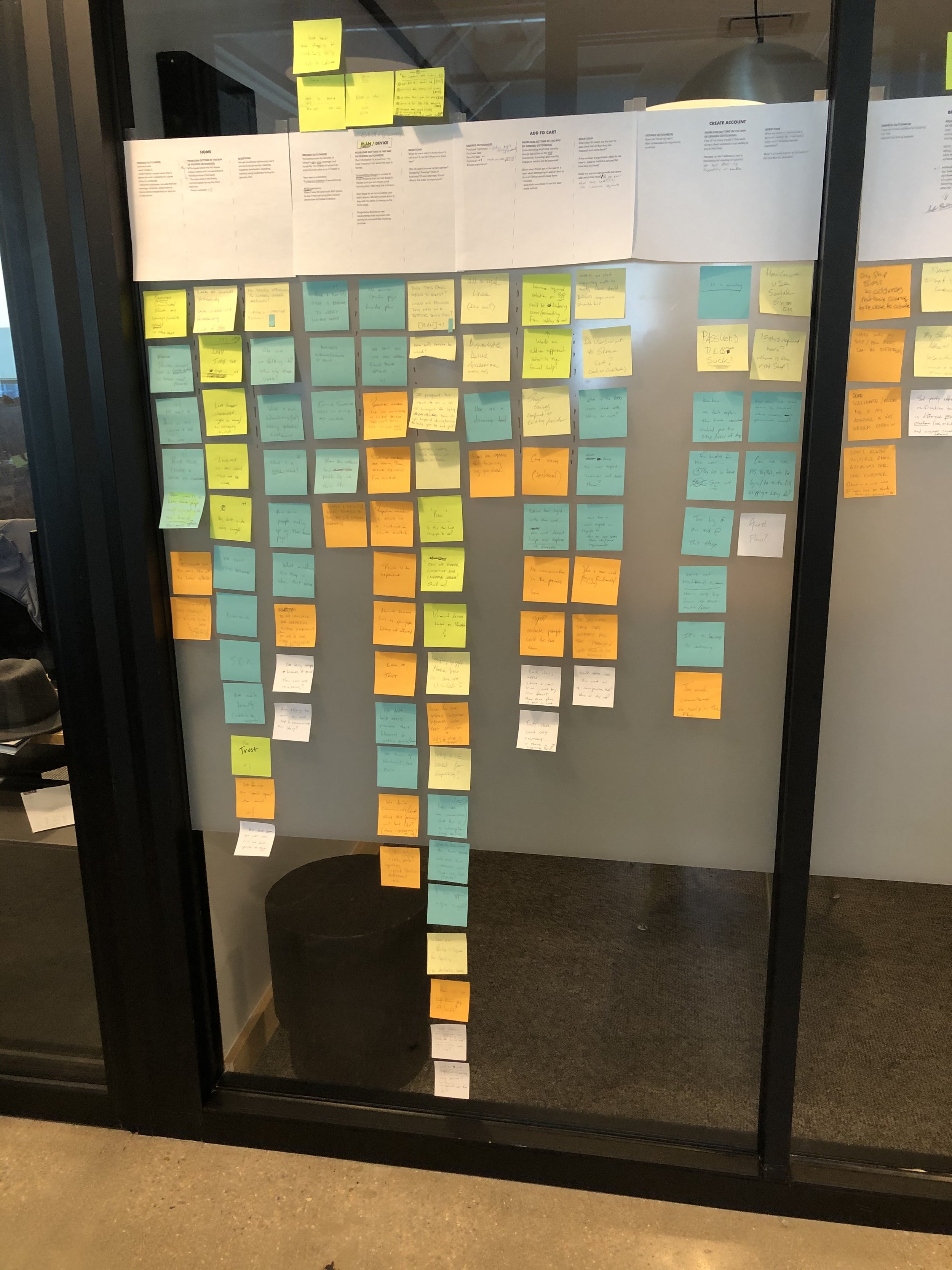
POST PURCHASE PAIN
The journey map, analytics, and customer feedback exposed a clear lack of guidance directly after the customer purchase of new service. Users didn’t know what to do as they waited for their new SIM card to ship.
-

AMBIGUOUS NEXT STEPS
When it came to porting (transferring a cell number from one carrier to another), and shipping expectations, users had limited feedback from our systems.
-

LIMITED SUPPORT AVENUES
The customer success team was the only avenue for help. Without a phone number to call and without a physical office location, it presented a new way of managing cell service issues that customers weren’t yet accustomed to.
-

BILLING MANAGEMENT IS A PRIORITY
Once customers set up new service, billing and upgrading their phone(s) was a key priority and the core reason they opened the app.
-

MOST HELP CHATS INITIATE FROM 'OVERVIEW' PAGE
The overview page was the default landing page for users upon logging in. Data showed that users were logging in and opening the help chat right away.
-

THE INTERFACE FELT "CHEAP"
Even though Visible is a value carrier, the product and marketing teams wanted to exude “clean simplicity” throughout the app so much so that users would be overwhelmed with the perceived value of the app and the brand as a whole.
I led the design team through a card sort activity and pushed my colleagues to become as minimal as possible in their choice of categories. I ran an open and closed card sort. Knowing what customers prioritized led to categories that aligned with the most common user-preferred tasks (which were confirmed by data).
CARD SORTING
IMPROVING INFORMATION ARCHITECTURE
I collaborated with key product and design partners to create a matrix that helped us grasp the variance in features for different users types. This is a great asset to have when thinking about how to design a variable experience.
USER MATRIX
ACCOUNTING FOR USER TYPES
THE DESIGN ITERATIONS
Armed with an abundance of knowledge, I contributed to a new visual exploration of the app that would take into account the information architecture and feature changes around better “next steps” guidance.
“Next Steps”
I began to inject a new, “lighter” visual direction while creating post-purchase guidance from scratch.
Exploration #
1
Focus
Next Steps
“Cards, Imagery, and Space”
Early stakeholder interviews uncovered a desire for an app that felt, “more fun to explore and open multiple times per day.” This exploration combined this desire with a light, nimble design.
Exploration #
2
Focus
Explore minimalism
“Discovery and Feature Exploration”
This stage put more focus on a focal, “explore” experience that would house yet-to-be-defined features meant to engage and entice users to continue using the app.
Exploration
3
Focus
Wireframe feature exploration
“Further Feature Refinement”
After getting the thumbs up on the previous pass, I began to integrate components of the current app with our new layout and feature adds to the “discovery” section.
Exploration
4
Focus
Thumbs up, further refine
“Combine and Boost Fidelity”
For this final pass, I paired with another designer to combine our concepts and take the redesign to the final prototype phase.
Exploration
5
Focus
High-fidelity final mockups
THE RESULTS
POSITIVE TESTING WITH USERS
The new account app concept tested positively amongst multiple user testing panels. I leveraged unmoderated testing using usertesting.com. Since deadlines are king, posting a test in the morning and having results in the afternoon while you continue to work on other things is tremendously valuable. Some key results are shown below:
THE RESULTS
18% INCREASE
…in ease-of-use ratings.
THE RESULTS
11% INCREASE
…in task completion speed related to bill pay and account management.
THE RESULTS
43% INCREASE
…in positive-attribute design descriptions by test participants.
CONCLUSION
A VETTED DIRECTION
The new direction for Visible’s core app experience and account redesign fixed fundamental UX issues and gave the app more personality in order to boost engagement and brand approval within the core experience. The redesign tested positively amongst users.
A clear, vetted direction was ready.
Despite extensive work to gain buy-in, and agreements from all departments, the project was put on hold. Around this time, several designers, including our own Head of Design left the company in search of roles with other companies.
